We are updating the map periodically with the latest available data. The text refers to the map as originally published, when data was complete through the week ending April 29.
Is Covid-19 mainly just a problem in New York? Not only New York City but the greater metropolitan area have been particularly devastated by the pandemic. This has led some to suspect that the city is skewing the overall data for the United States, so that a national view can’t capture what individual states are experiencing.
There is clearly some truth to this: the severity of the pandemic varies greatly from state to state. With this article, we are offering one way to visualize these differences.

For each state, we have compared Covid-19 deaths over a rolling weekly period to what we would usually expect at the same time of year from other causes of death. These causes include car crashes, flu and pneumonia, Alzheimer’s disease, and heart disease (the normal leading cause). The point of comparison is the same week in 2018, the most recent year for which complete weekly figures are available from the CDC and the National Highway Traffic Safety Administration. The year 2018 also saw the deadliest flu season on recent record.
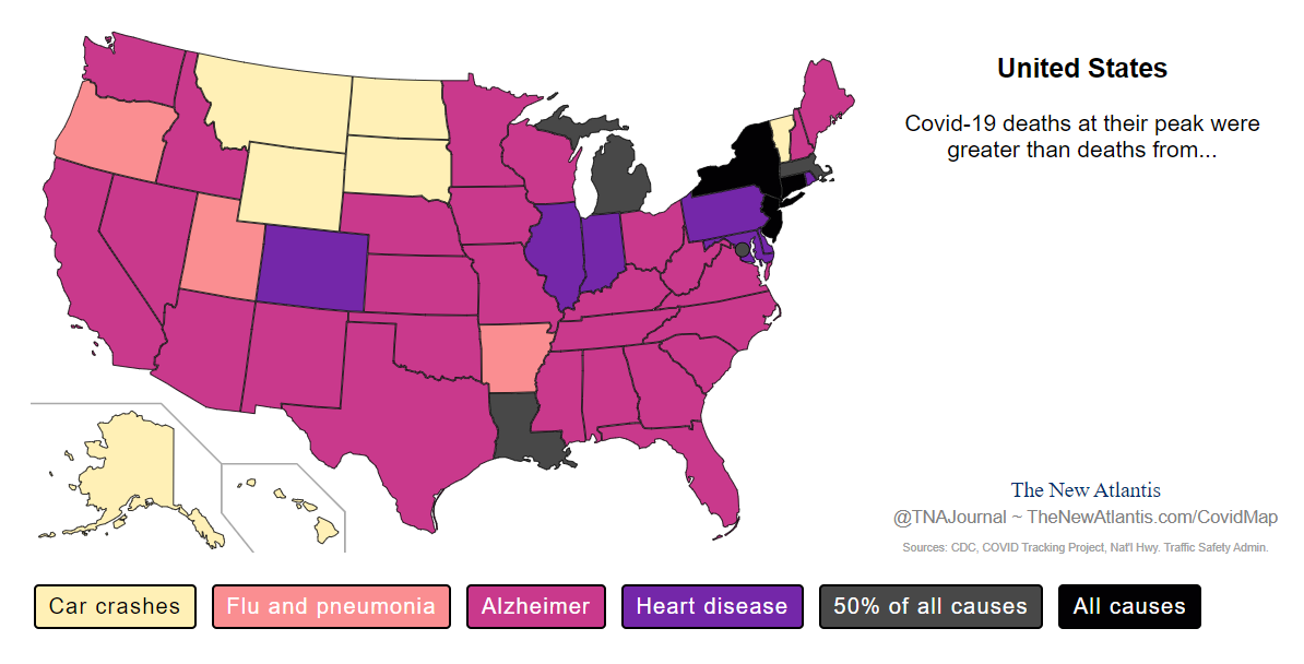
The color of each state shows the typical cause of death that had been surpassed by Covid-19 in that week. For example, in Texas on the week ending April 29, 2020, coronavirus deaths were greater than the number of Alzheimer’s deaths in the same week in 2018.
Click on an individual state to see the detailed death statistics, and use the slider to scroll through time.
Levels of Death
As is clear from the map, not every state has been affected equally. To help understand the regional variation, consider this image, which shows each state’s peak in deaths relative to typical causes:
Roughly, we might group the degree of impact into four levels:
Worse than normal total deaths
In three states, Covid-19 deaths have at some point surpassed the typical total from all causes. These are New York, New Jersey, and Connecticut.
Worse than heart disease
Heart disease is typically the leading cause of death in every state in the union. In 2018, 655,381 people died from it nationwide. In ten states and the District of Columbia, Covid-19 has at some point surpassed the typical rate of death from heart disease:
| Midwest | Northeast and mid-Atlantic | South and West |
|---|---|---|
| Illinois | Delaware | Colorado |
| Indiana | District of Columbia* | Louisiana* |
| Michigan* | Maryland | |
| Massachusetts* | ||
| Pennsylvania | ||
| Rhode Island |
Worse than Alzheimer’s disease
Alzheimer’s disease claimed the lives of 122,019 Americans in 2018 — about twice as many as influenza and pneumonia, and three times as many as car crashes. In twenty-seven states spanning every region of the continent, Covid-19 deaths have surpassed Alzheimer’s.
Worse than car crashes or than flu and pneumonia
Ten states have so far been more lightly affected by the pandemic, with deaths peaking at rates only worse than those typical for car crashes or for flu and pneumonia. Six of these are Western states: Oregon, Utah, Montana, Wyoming, North Dakota, and South Dakota. The others are Vermont, Arkansas, Alaska, and Hawaii.
State by State
It is plainly true that the greater New York region has been much harder hit than the rest of the country. But the greater Northeast region, the mid-Atlantic, the Midwest, and Louisiana and Colorado have also seen severe outbreaks. Only a small number of states have seen peak death rates that are relatively low — on the order of car crashes or flu and pneumonia.
In terms of the current spread of the disease, the map offers some reason for optimism. Several Northeastern states appear to be, at least for now, past a peak in deaths. But the Midwest appears still to be in the grip of an outbreak, with numbers growing particularly sharply in Indiana. So does the mid-Atlantic, with recent upticks in Delaware, Maryland, and the District of Columbia.
Other ways to visualize the current spread by region are available at the Rt Covid-19 website and the New York Times’s county tracker.
Sources and Data
We have used Covid-19 death counts from the COVID Tracking project. These numbers remain subject to some criticism on the grounds that they include not only those who died of Covid-19 but those who died with it, resulting in an overcount. On the other hand, these figures likely exclude many people who have died from the disease at home or in a hospital without being tested.
A more accurate picture may come from “excess mortality,” an estimate of how many more people died from all causes than would normally be expected at the same time of year. The New York Times and the Washington Post have recently published such estimates, showing significant spikes in deaths overall in the hardest-hit states.
From March through April 4, the Washington Post estimated 15,400 excess deaths, twice the number attributed to the virus at that time. From March 8 through April 11, according to the New York Times, seven states had total death rates nearly 50 percent higher than would normally be expected.
These data confirm that the official Covid-19 death figures are not a statistical artifact. Such spikes in the normal death rate cannot plausibly represent people who would have died at that time anyway. They also confirm that the rate of excess deaths in each state is highly correlated with the rate of reported Covid-19 deaths — implying that state-level death counts really do show us people dying of, and not merely with, the virus.
However, excess mortality figures have limitations of their own, because of other ways that the pandemic has affected death rates. There are reports that deaths from car crashes and homicide have dropped under the lockdown. It is also plausible that deaths from other causes are increasing due to strain on the health care system, patients’ fear of seeking treatment, and the postponement of what have been classified “elective” procedures (including many cancer treatments).
Some data analysts offering similar comparisons have begun to use data on mortality for 2020. We have opted against this, as current figures for total deaths, or deaths from other causes, are still fragmentary. The National Center for Health Statistics estimates that only a quarter of mortality data is complete within two weeks, while just over half is complete within four weeks, and even within eight weeks only around three quarters of the data will be complete. Since most Covid-19 deaths have occurred in the past eight weeks, these delays mean that detailed comparisons to other causes are possible only relative to past years.
The COVID Tracking Project, although likely to offer a significant undercount, continues to be the most reliable, up-to-date, precise source, drawing on daily updates from state health departments.
Finally, instead of averaging past years, as other analysts have, we have opted to compare Covid-19 to a specific year, 2018, to allow for a comparison to how deaths varied across a particular past season. Note that there are some gaps in this data, with some states missing figures for Alzheimer’s disease and influenza and pneumonia for some weeks.