Note: Scroll below or click here for updates to the charts.
How deadly is Covid-19 compared to seasonal flu, past pandemics, or car crashes?

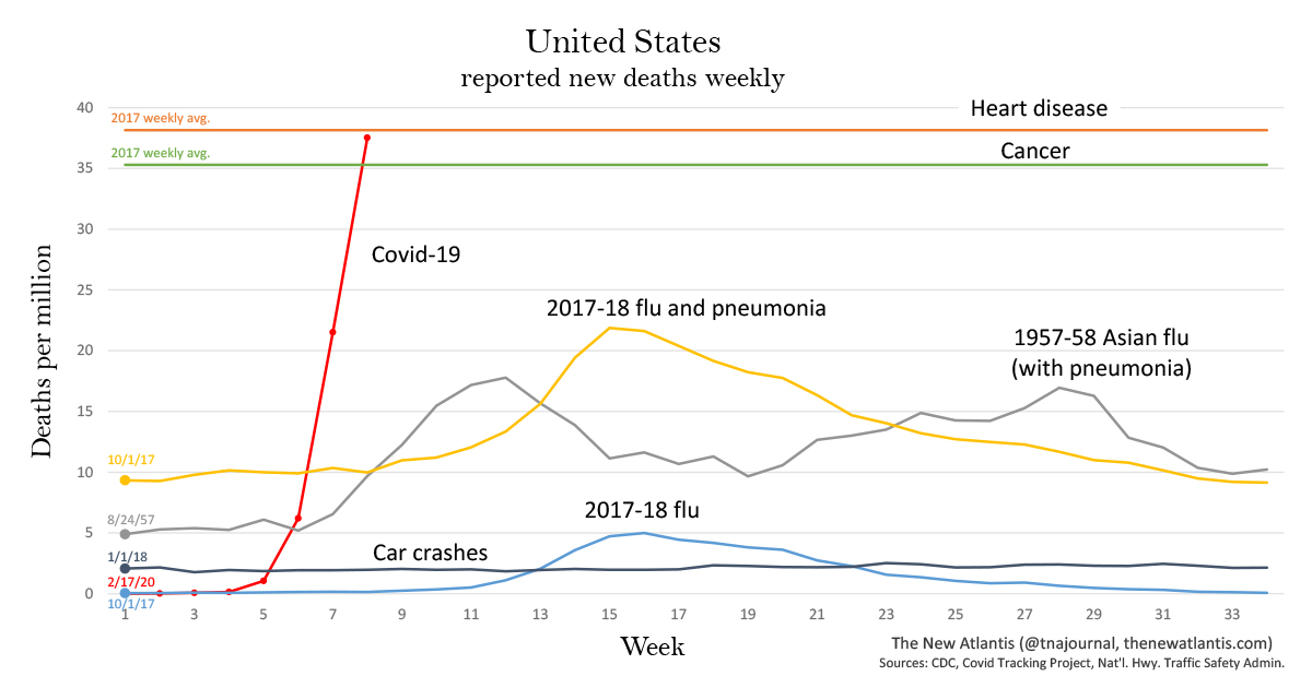
To offer context, we have produced two charts showing coronavirus deaths along with deaths from other common causes in the past to which the disease has recently been compared. One chart shows deaths for the United States, the other for New York, the state hardest hit.
Note that the data sets begin at different points in the year (as marked on the left). Also note that the figures shown here are for new deaths each week, not for cumulative deaths.
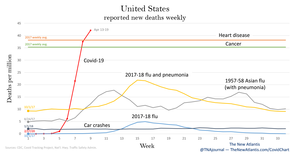
The chart shows deaths per capita to allow for comparison of data from different years. Deaths are shown from:
- Covid-19, starting from February 17. (Covid Tracking Project)
- The 2017-18 flu season: This was the deadliest recent flu season. The chart shows one line for deaths attributed directly to flu, and another for deaths attributed to either flu or pneumonia. The smaller line is an undercount of flu-caused deaths, the larger is an overcount, with the real number lying somewhere in between. (More on this below.) The data begin on October 1, 2017, which the CDC considered the first week of that flu season. (CDC)
- Heart disease and cancer: The first and second leading causes of death in the United States. The chart shows total 2017 deaths averaged per week. (CDC)
- Car crashes: Weekly deaths beginning from January 1, 2018. (National Highway Traffic Safety Administration)
- 1957-58 Asian flu pandemic: Weekly influenza and pneumonia deaths beginning from August 24, 1957. These data come from a contemporary CDC program that surveilled 108 American cities with a total population of about 50 million people. We have used that figure, rather than the total U.S. population at the time, to calculate deaths per million. (CDC)
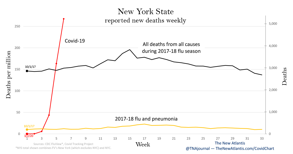
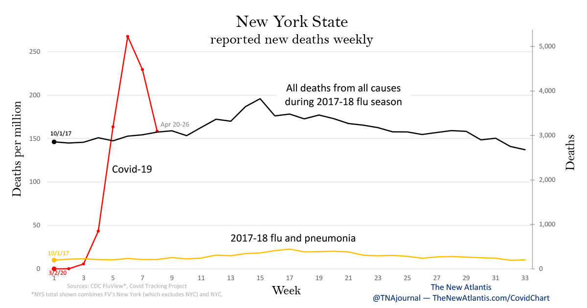
Because the number of weekly Covid-19 deaths in New York is now larger than the typical number of weekly deaths from all causes, we are omitting most of the individual causes from the chart. And because the state’s population has been highly stable over the time periods considered — decreasing by just 0.7 percent since 2017, according to the latest Census Bureau estimates — we have chosen to show both absolute deaths and deaths per capita. The causes shown are:
- Covid-19 deaths, starting from March 2. (Covid Tracking Project)
- The 2017-18 flu season, with week 1 beginning on October 1, 2017. (CDC)
- All deaths from all causes for the same period as the 2017-18 flu season. (CDC)
Note the markedly larger scale of deaths per million on the New York chart as compared to the United States — indicating how much harder Covid-19 has hit that state than the country as a whole.
Uncertainty about Flu and Covid-19 Deaths
There is considerably more uncertainty about how many deaths are caused by the flu than public discussion might suggest. Determining this number is not as simple as counting up death certificates listing influenza as the cause.
Many deaths have multiple causes. The flu can cause other illnesses, such as pneumonia, which in turn can cause death. The CDC thus includes “influenza-associated deaths” in its estimate of the toll of the flu. Conventionally, statistics often group together deaths from influenza and pneumonia. Furthermore, many estimates try to account for under-reporting of flu deaths: Not everyone who dies of an influenza-associated illness has been tested for the flu.
In short, the number of flu deaths as reported by the CDC and often cited in public discussions — between 24,000 and 62,000 deaths for this past season — is a rough estimate of how many people had the flu and died of illnesses that were likely associated with it, whether or not directly caused.
Instead of using estimates, on our U.S. chart, we have shown one line for deaths in which influenza was listed as a cause (which undercounts influenza-associated deaths); and another line showing deaths in which influenza or pneumonia was a cause (which overcounts flu deaths, as many pneumonia cases are not caused by flu).
With Covid-19, there are similar difficulties in arriving at the true number of deaths caused by the virus. Skeptics of the reported death counts have argued that most people who die with the virus don’t die of the virus. This is surely true in some cases, as it is with the flu. In many deaths, webs of causation are tangled.
However, in addition to some possible overcounting, there may also be significant undercounting. Reports from Northern Italy and New York suggest that far more people are dying in outbreak areas than are being reported:
In the first five days of April, 1,125 people were pronounced dead in their homes or on the street in New York City, more than eight times the deaths recorded during the same period in 2019, according to the Fire Department.
Many of these people — as well as many who die in hospitals — are not being tested for the virus, and therefore are not included in the official death counts.
The Deaths in Context
Even with the limits of the available data, we can still draw some reasonable conclusions about how Covid-19 compares to other causes of death — and about what these comparisons often miss:
Different time scales: We are still early in this pandemic. It has only been a few weeks since the first reported U.S. deaths. Comparing these deaths to, say, an entire year of deaths from car crashes or influenza is not meaningful.
A spike: Perhaps the most noticeable feature of both graphs is the Covid-19 spike — the rapid growth in deaths since the pandemic began. Car crashes, by contrast, show little variation week to week. And even compared to past flu seasons or pandemics, the rate of increase in Covid-19 deaths is markedly faster.
The number of new deaths reported in the U.S. in the week beginning March 16 was 678 percent higher than the previous week. In New York State, the number grew thirty-six-fold the same week. By comparison, the worst one-week increase in new flu and pneumonia deaths during the 2017-18 flu season was 26 percent, and during the 1957-58 Asian flu was 48 percent. Although the growth in Covid-19 deaths is now slowing, the number of new deaths for the week ending on April 5 was still more than double that of the week before.
A leading cause of death in the United States: Several weeks ago, coronavirus deaths were few in comparison with other causes. But last week, reported U.S. Covid-19 deaths were just shy of the normal rate from heart disease, usually the leading cause of death.
More than all typical deaths in New York: Strikingly, in the state of New York, the number of people who died with coronavirus last week was more than any other cause of death — in fact, 76 percent more than the average number who die in a week from all causes combined.
In the worst week of the 2017-18 flu season, New York saw 445 deaths from flu and pneumonia and 3,481 total from all causes. Last week, the state saw 4,694 reported Covid-19 deaths alone. These figures must put to rest the “dying with but not of” line of skepticism. The idea that this many people would have died anyway even without Covid-19 is simply not credible.
Any serious attempt to put coronavirus deaths in context by comparing it to some other cause of death in a previous year must acknowledge the marked differences in the Covid-19 trend — most notably, the rapid spike in deaths that is still underway, and the wide range of uncertainty about when it will peak, how high it will peak, and whether it will peak only once. As long as the pandemic is rapidly spreading, these comparisons will be fraught.
Perhaps a better way to state the danger posed by the coronavirus is just that we cannot easily compare it to any precedent in recent history. Nor do we need to dispute projections about future deaths to recognize what has happened already. Amid the statistical noise is a powerful signal. The question is whether we choose to see it.
Updates
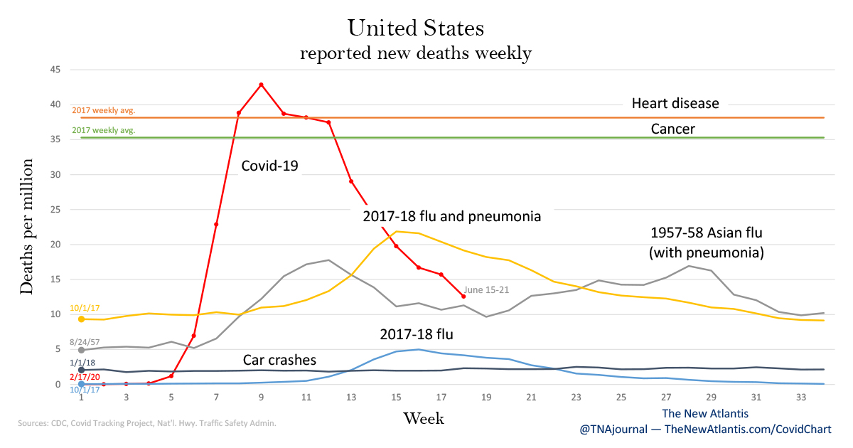
Tuesday, June 23 — An updated chart is available for the United States. Note that the COVID Tracking Project has retroactively updated its numbers, resulting in small shifts in some weeks compared to our last update. For example, the data for weeks 10 through 13 has shifted slightly downward, while for some earlier weeks it shifted slightly upward.
Tuesday, May 19 — The COVID Tracking Project replies to our query about retroactive changes to the death toll figures: “We’d have to go back through each and every one of them, but some states have made substantial changes to their data that we have no real choice but to reflect. Each state is a little different, but the impact on the cumulatives is pretty small. Washington and Massachusetts are among the states doing this kind of update.”
Monday, May 18 — Updated charts are available for the United States and New York State. Note that some of the data for the United States has changed retroactively. For example, when we first published this article, the COVID Tracking Project listed the number of deaths in the U.S. through April 12 as 21,919, whereas it now lists the number as 22,237. This is an upward revision of 1.5 percent, an increase just large enough to move the point for that week up to the line for heart disease, whereas when we first published the article, the point was still just below the line for heart disease.
All of the retroactive changes are similar: upward revisions of a few percent or less. The data for New York State has not changed retroactively. We are awaiting a reply from the COVID Tracking Project to a request for comment on the reason for the retroactive changes.
To accommodate these revisions and clearly preserve a record of how the available data changed over time, we are also changing the way we update this page. The article above will now show the data as it was available from the COVID Tracking Project when the article was first published on April 13. Subsequent updates to the charts, including both new weeks and any retroactive changes to past weeks, will be shown here in the updates section. To avoid cluttering this section, we will only display the images for the latest update, but will preserve the links to past updates.


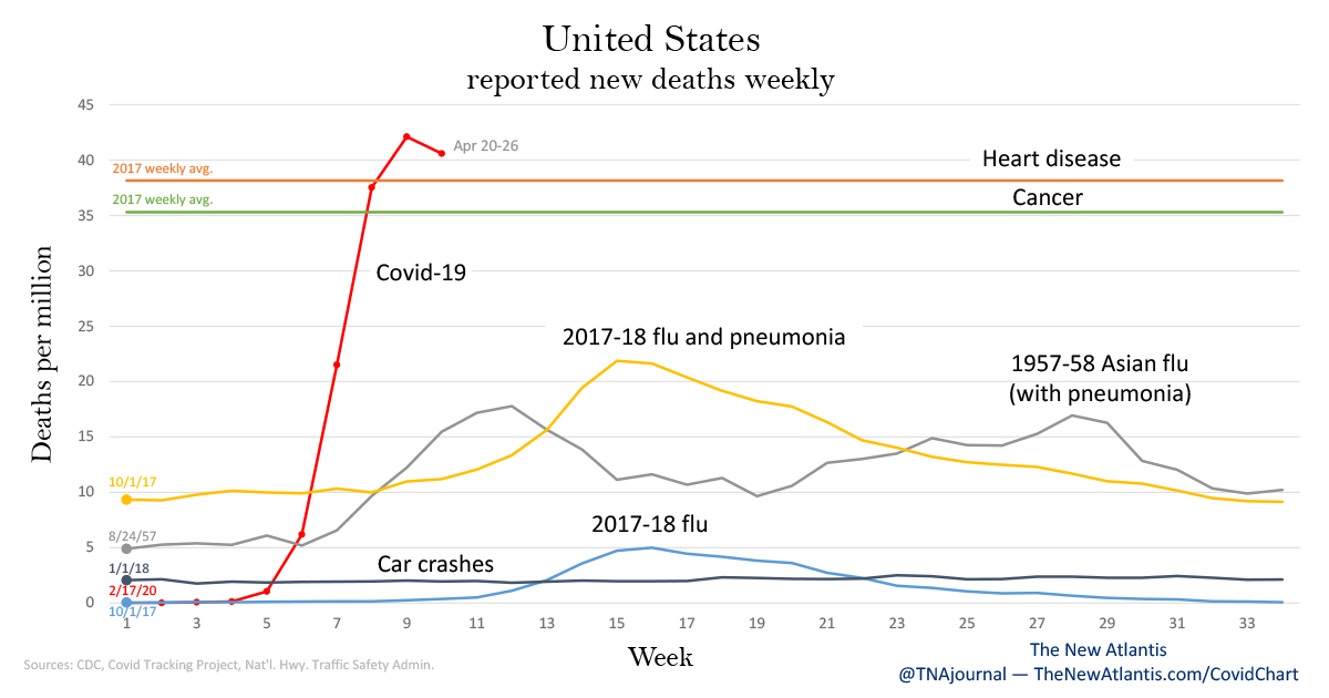
Monday, April 27 — The charts have been updated with data from the latest week (April 20-26). We are also changing the way we update the article: the article above will now show the latest charts, and we will keep links to each week’s updates in this section. This week’s version of the charts: United States and New York State.
Tuesday, April 21 — Here are updated versions of the charts, with data from the latest week (April 13-19) via the COVID Tracking Project: United States and New York State.
Monday, April 20 — An important correction to our original article: On the earlier version of the New York State graph, the data sets for the 2017-18 flu season (both deaths from flu & pneumonia and deaths from all causes) mistakenly excluded New York City.
Our data source is the CDC’s FluView Interactive, which lists data for the 50 states plus New York City. However, the data described as the state of New York excludes New York City. New York is the only state in the data set whose figures do not include the entire state. To arrive at the correct figures for New York State, we have now added in the figures for New York City. A CDC spokesperson confirmed that adding the two sets of data produces the correct totals for New York State, and explains that the state and the city “have separate vital statistics offices.”
We have updated the article with the corrected chart. (For reference, the old version can be found here.) We have also updated corresponding numbers in the text. Of particular note, the previous text stated that “in the state of New York, the number of people who died with coronavirus last week was more than any other cause of death — in fact, more than twice the average number who die in a week from all causes combined.” This figure has been corrected from more than twice as many to 76 percent more.
We are grateful to a careful reader for pointing out to us this oddity in the CDC’s data gathering, and to Rina Shaikh-Lesko, a freelance science journalist, who also flagged the issue on a Reddit discussion page about the CDC data set.
Tuesday, April 14 — The original version of this article incorrectly stated that in the week where new deaths grew at the highest rate over the prior week, the growth rate was 663 percent for the U.S. and thirtyfold for New York State. The correct numbers are 678 percent and thirty-six-fold, respectively. Additionally, when discussing the dates of weeks of Covid-19 deaths, the article incorrectly specified the last days of those weeks as the first days. For example, “the week beginning March 22” has been corrected to “the week beginning March 16.”