
I’ve been really taken by the images in this blog post on the recent resurrection of the cover-design style of the old Pelican Specials. What strikes me, as I expect it will strike you when you click through, is that the attention given to reproducing the old cover art is, shall we say, not quite matched by the attention to typography.
The old Penguin/Pelican cover styles have been fetish objects for some time now. I am especially fond of M. S. Corley’s redesigns of the Harry Potter covers:

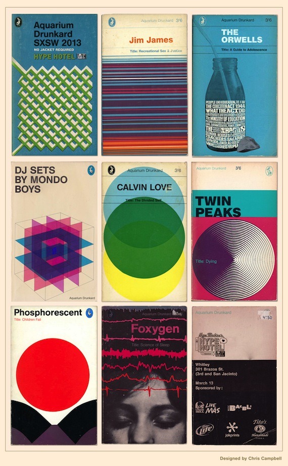
And this application of that classic style to bands and TV shows is pretty cool:
But when you’re making a cover for an actual book it would be nice if the fidelity to lovely tradition was carried through to the text itself. The dissonance between the quality of the cover of that Jacqueline Kent book and the unimaginative flatness of its text is troubling.
Now, this is not to say that we want books whose typographic style reproduces too slavishly the aesthetic of another era: when that happens the result is, as my friend Edward Mendelson has noted, “typographic kitsch.” (American Typewriter, anyone?) But in this post-TeX world there’s really no justification for the amount of typographic blandness or incompetence that we see today.
Not incidentally, this is one reason it has been such a pleasure for me to work — three times now — with Princeton University Press. Their attention to all the details of design is really admirable. I especially commend the books in the Lives of the Great Religious Books series to which I have contributed: they are lovely to look at, delightful to read, and a real pleasure just to hold. You can see a few of their admirable features just by clicking that link, but you really need to take one in your hand to get the full effect.